All good WordPress theme companies develop their own WordPress framework. This framework allows them to build a standard set of options and features into all of their themes. It also helps them develop themes more efficiently.
I have used dozens of WordPress frameworks over the years. The latest one I have tested is called Cherry Framework.
Cherry Framework is a WordPress framework that was developed by template veterans TemplateMonster. They were kind enough to send me a copy of the framework for testing.
TemplateMonster are a company I know well as I used to promote them heavily around 2002 to 2004. More than ten years later, I continue to earn money through their pioneering affiliate program MyTemplateStorage due to referrals. From an affiliate’s point of view, they were miles ahead of the competition. They allowed affiliates to build template stores in minutes and earn thousands of dollars a year.
TemplateMonster is still one of the largest website template stores on the internet. They offer themes for WordPress, Joomla, PrestaShop, Magento, Moto CMS, and more.
More and more of their WordPress themes are being developed using Cherry Framework. Let’s look at what the framework offers.
What Does Cherry Framework Offer?
Cherry Framework has everything you would expect from a WordPress framework. It was designed with WordPress child themes in mind so that you can customise your theme without worrying about overwriting changes during the next update.
The framework is responsive so looks great on any computer and any device. Cherry was also built upon the popular framework Bootstrap, which makes it easier for developers to work with CSS and Javascript.
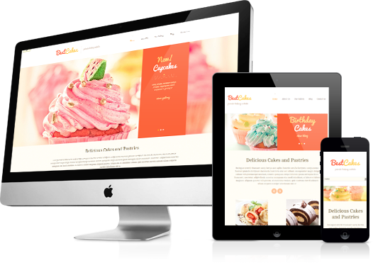
Cherry framework also boasts shortcodes for styling content, a modern portfolio template, booking form, localisation features, custom widgets, and good social media integration. Bloggers will love the fact that WordPress post formats are supported too.
A Look at the Cherry Framework Settings Area
To help you understand what the framework can do, let us look at the settings area. After all, from a user point of view, that is what a framework is all about.
The main settings area is divided into seven main tabs: General, Logo and Favicon, Navigation, Slider Settings, Blog, Portfolio, and Footer. Thanksfully, settings page are not too long.
The general tab should really be renamed Design, as that is what it focuses on. It allows you to change the background colour or your website or upload a suitable background image. The colour of your header, buttons, and links, can also be changed.
Every aspect of your body text and header tags can be changed too. You can change the font size, type, and colour. Since Google Web Fonts is supported, there are several hundred fonts available for selection.
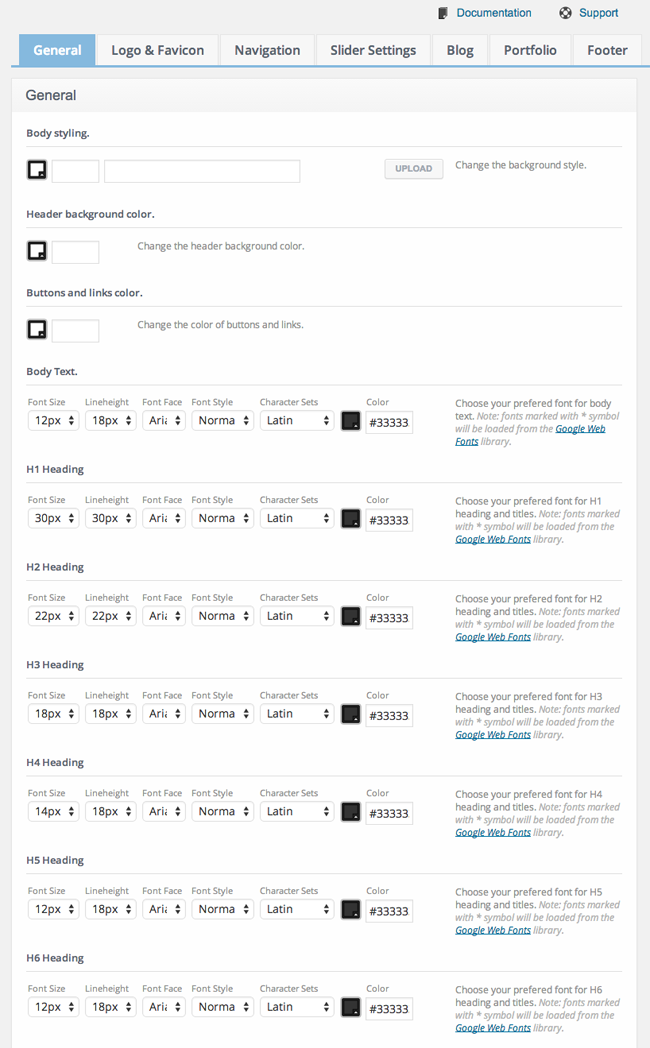
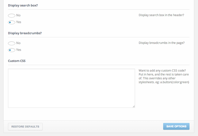
The header search box and breadcrumbs can also be changed from the general settings page. Custom CSS classes can also be added here.
A logo and favicon can be uploaded in the second tab. A text logo can also be chosen if you do not want to use an image.

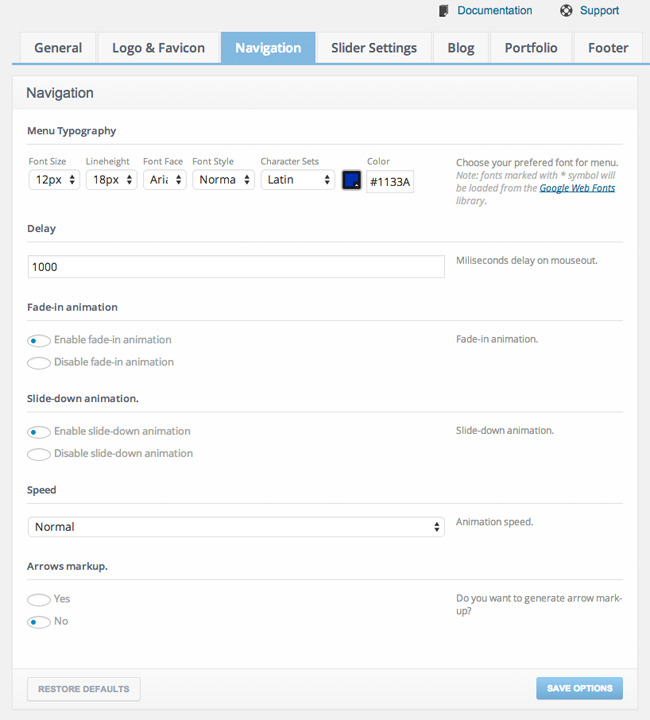
The font and style of your main navigation menu can also be customised through the settings area. Fade in and slide out animations are available and you can make the animation speed slower or faster than normal.
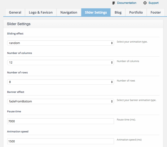
The look and feel of your sliders can be modified too. There are around two dozen slider effects and nine banner effects available. Rows, columns, pause time, and animation speed, can all be changed.
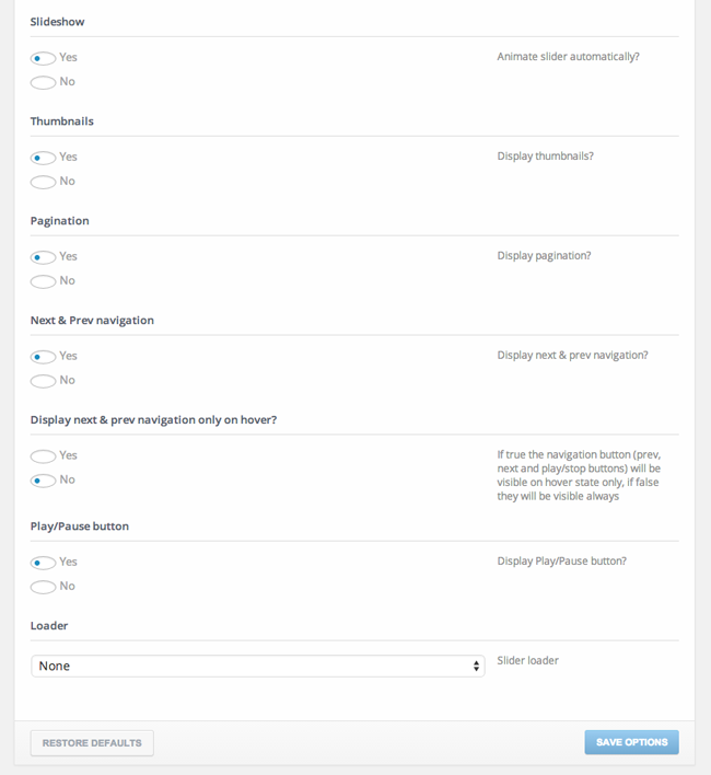
Other slide options include thumbnails, pagination, navigation, and a play/pause button. For an integrated slider, there are a lot of useful options.
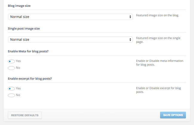
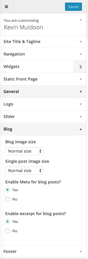
The blog settings page allows you to change the blog title and related posts title. You can also move the sidebar. In the screenshot below, you can see that it can be moved from the right to the left. However, other Cherry Framework based designs may offer more options.
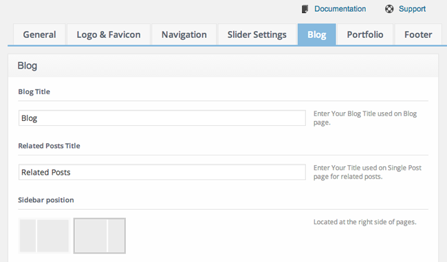
There are two options for featured images: Normal and large. Meta details and the excerpt can also be disabled from the blog settings page.
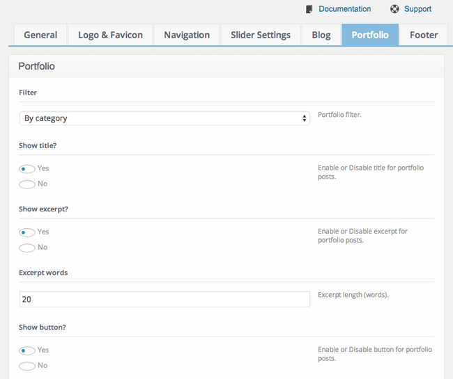
Just like sliders, the general setup of portfolio items can be changed through the settings area. You can modify the portfolio filter and excerpt length. You can also disable the portfolio title and excerpts.
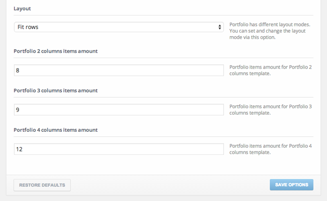
Two different portfolio layouts are available: Fit rows and masonry. You can also change the number of items that are displayed for each portfolio template.
The last settings page is for the footer. It allows you to change your footer copyright text, integrate Google Analytics, and define your Feedburner URL. A footer menu can also be displayed and the font and colours used for this menu can be modified.
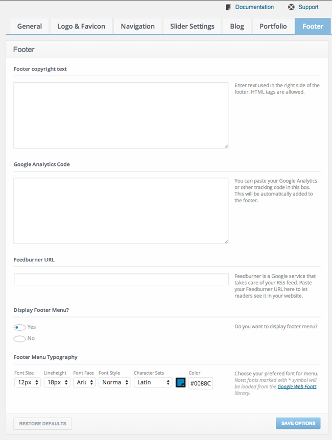
You will also have noticed that at the top of each page are links to “Documentation” and “Support”. The documentation link takes you to a quick start guide, while the support link takes you to WordPress tutorials.
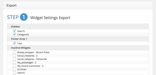
Cherry Framework allows you to export your settings. Well, kind of. Currently, there is no option to export the website settings you have configured and import them to another website you own.
The export page only allows you to backup your widgets. While I do welcome the option to backup widgets, I cannot help but be annoyed there is no option to export framework settings. There are alternative solutions to exporting widgets; however there is obviously no alternative solution to exporting Cherry Framework settings. Hopefully, this is something they address in the future.
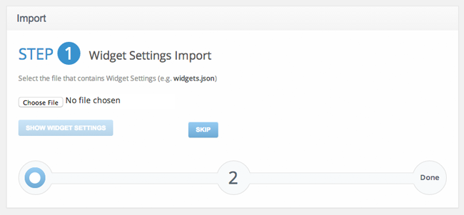
Importing your widget settings from another website is simple. All you have to do is upload the widgets.json file that you exported previously.
Cherry Framework helps you avoid switching between your settings page and live website in order to see changes. All major customisation options are integrated into the WordPress customize tool. This helps you see the changes you make in real time.
In my opinion, this is one of the coolest features of the framework.
Custom post types for additional features such as slides and portfolios use the default WordPress post editor. So adding new items is self-explanatory.
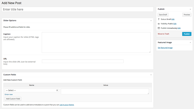
Depending on the TemplateMonster theme you are using, other custom post types may be available, such as testimonials, clients, FAQs etc.
Some Examples of Cherry Framework Themes
As you have seen, Cherry Framework is a competent WordPress framework that has a lot of great features. However, unless you are a developer, you are not going to get the most out of a framework. What really makes a good WordPress framework great is the themes that are available for it.
Template Monster have over 1,750 WordPress Themes in their directory. More and more of their designs are being developed using Cherry Framework.
Here is a brief look at five of the best. Unfortunately, there are very few good blogging themes released under the Cherry Framework thus far. Most of them are business related.
Each of these designs retail at $75. And for good measure, they all have generic unoriginal names :)
Flat Consulting is a business design that draws inspiration from Windows 8. It features a custom post type for projects.

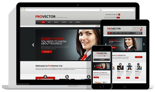
IT is another great looking business design. It has a stylish navigation menu and a cool homepage slider.
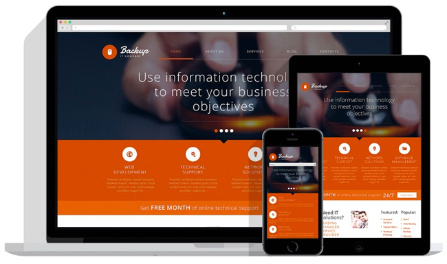
IT Consulting is a minimal (ish) business theme that has a large homepage slider. Custom post types for services and projects are also available.
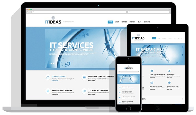
Financial Advisor was designed for finance websites, but could be used for any type of business website. It boasts a large homepage slider, featured posts on the home page, and custom post types for services and projects.
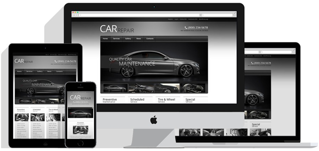
Last but not least is Car Retro Elegance. You guessed it – it was designed for businesses! Don’t let that put you off as it’s very well designed.
It has a great looking slider on the home page and a cool navigation menu.
Since all of the above themes were built using Cherry Framework, they all have the common features I mentioned earlier such as slides and portfolios.

In time, TemplateMonster will hopefully build a bigger variety of designs using Cherry Framework. This will broaden their appeal to other types of WordPress users (i.e. not just businesses).
Final Thoughts
All in all, I thought Cherry Framework was pretty good. It does not do anything unique, but it has all the essentials.
From a user point of view, I feel that the key factor in WordPress frameworks is balance. If there are too few options, the framework does not help make important changes on your website. However, too many options can be overwhelming and make the framework difficult to use.
I think TemplateMonster got the balance with Cherry Framework right. It’s not as minimal as a framework as Genesis, but it doesn’t have dozens of settings pages either. They were right to integrate everything into the WordPress Customize tool.
Visit CherryFramework.com to download the framework free of charge and try it out for yourself :)
Thanks for reading.
Kevin

