If you have read this blog before then you will quickly realise that I changed the blog’s theme last night. I liked the last theme but it was kinda basic and I wanted to present a more professional image for myself and the blog. The new BloggingTips design will be live in a few days and I will also be releasing a unique wordpress theme through BloggingTips next week.
I definately think it’s important to improve a blog’s design when you have the time/money. Even if the blog you are using is top notch a new image could get you as lot of extra traffic and keep your site fresh.
- System0 Redesign
I looked around at various themes however I decided to go with the premium theme from Elite by Design. It’s a good theme and didn’t take much customisation to get it looking the way I wanted. That being said, I’m not too keen on the header so I may get a logo designed for it soon. I’ll probably tweak the design a little over the next few months so if you see any problems with the design or have any suggestions as to how to improve it please let me know. Other than that I’m pleased with the blog’s new look. I’ve also decided not to display the feedburner count for a while to see if it has any affect on the number of subscribers here. - BloggingTips Redesign
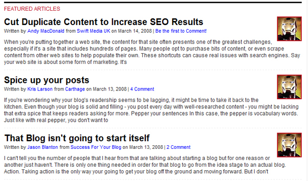
The redesign of BloggingTips is almost complete and should be live in the next few days. It has been designed Ptah Dunbar, a designer who currently works at Georgia State University as a web developer. He has been discussing the redesign on his blog(funnily enough, Ptah is releasing a new theme for his blog this week too!) :)Regular readers of BloggingTips should feel right at home with the redesign, mainly because rather than developing a brand new theme, Ptah has improved upon the current theme. He’s removed the clutter I had added to it, made it more professional looking and put more emphasis on content.
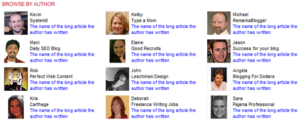
Here’s a preview of some areas of the new design :
The subscribtion box has been vastly improved and is now much more presentable.

Currently the site displays the last 7 posts in full on the home page with exerpts on archive pages. The new design will highlight the last 3 articles using excerpts and will link to the next 5 with smaller previews.

At the bottom of the home page readers can now browse the posts of their favourite blogger more easily.

One of the main things Ptah is reduce the amount of information on the home page and in my opinion this presents a much more professional image of the site. With the site about to break the 2,000 subscribers count any day now I really think this design will push the blog to the next level.
- Release of new theme through BloggingTips
Rajat Bhadani contacted me this morning offering his services. He runs the blog Review Saurus however his design services are through Design Saurus. He has designed for many top bloggers including Daniel Scocco’s Daily Blog Tips, infact, Rajat designed Daily Blog Tips Daily 32 Wordpress Theme. The theme will probably be ready in a week so I will give you all an update on it when it has been released :)


