Searching for a suitable WordPress theme for your website can be a tiring fair. It usually begins with an optimism that you will find the perfect design, but it soon becomes a time-consuming task when you do not find the right theme within the first few days.
Over the last seven years, I have used WordPress for all of my content based websites. Therefore, I have been in the position of looking for a new design more times than I care to remember. Sometimes it takes days, sometimes it takes weeks.
My recent search was for a suitable blog design for this blog. I briefly touched upon the frustration of finding this new design yesterday. Over the course of a few weeks, I looked over close to one thousand themes, checked out the demo thoroughly of at least one hundred more, and tested around a dozen or so free themes from WordPress.org.
It did not take me long to be reminded that designers rarely understand the needs of bloggers. This is more apparent in a marketplace such as ThemeForest. Most of the designs that are sold there try to do everything. They can be used for a business, for a portfolio, for a blog, for an online shop, for a community. These designs are versatile, but they are not always the best solution for any one thing. This is particularly true for blogs that do not need additional functionality built-in like review systems, rating systems, eCommerce integration etc.
The designs that were created specifically for blogs sometimes place an emphasis of style over substance. Take navigation, for example. Rather than just use a traditional menu in the header, many designers are trying to make their designs “sexier” by making the menus discrete. Cool, yes. Practical, no.
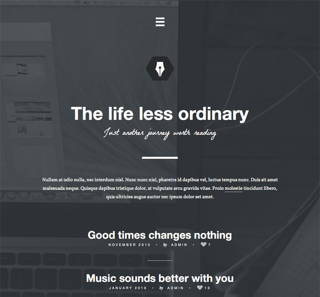
The design Reblog is an example of this (though perhaps not the best example). It places a small menu icon at the top of its beautiful design. Visitors need to click on the icon in order to open up the navigation menu. A few other designs hid the sidebar completely and only displayed it if the cursor was moved to the side of the page.

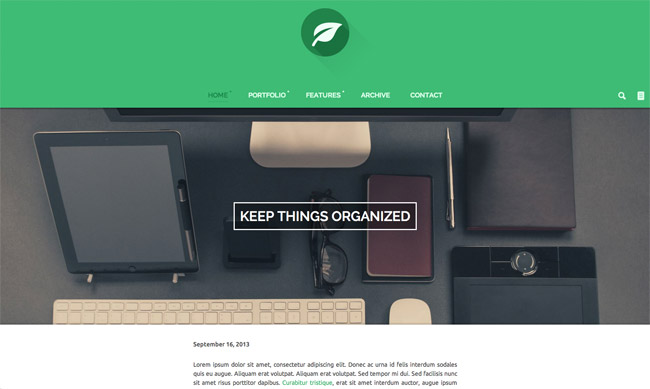
Another big problem that I see with most of the designs on ThemeForest is the featured image. The blog template always includes massive featured images. These images are sometimes 1,000 pixels in width and several hundred pixels in height.
This presents a lot of problems.
Firstly, finding super sized images every time I want to publish a post is a real pain in the ass. It is not so bad for travel bloggers who are uploading photographs with every single article; however, for most people it means paying money for high quality images from a stock image service. This is also time-consuming, which means you are unlikely to complete a post in thirty minutes.
Secondly, the blog templates are not flexible. They are set up to be used in one way and one way only. The design will look super cool if you upload a 1,000 by 650 pixel featured image; however if you upload an image that is 200 by 200 pixels, the whole design gets messed up. Designers usually reply to complaints about this from buyers with something along the lines of “The theme was not supposed to be set up that way”. This forces you to either use a ridiculously large featured image for every post, or abandon the theme and try something else.
A good example of this is Leaf.

ThemeForest currently has around four thousand WordPress themes, so I do understand the argument that there is something for everyone there. I am not complaining for the sake of complaining. It just surprises me that few designers are designing traditional blog designs for the premium market. Particularly as there is an abundance of blog designs in the WordPress.org theme directory. A large percentage of the themes on sale there look great, but are not really practical for blogs.
StudioPress seem to be one of the few theme stores that understand the needs of bloggers. MyThemeShop is another. Their designs are not always pretty or flashy, however they are perfect for blogs that are publishing content every day.
What’s your thoughts on this? Do you think designers need to pay more attention to bloggers and think more about the practical aspects of a blog design?
Kevin

