Due to my cravings for cool gadgets, I check the crowdsourcing website Kickstarter frequently. Some amazing projects have been funded there recently such as the OUYA video games console, Pebble watch and Zach Braff’s sequel to Garden State.
One project that caught my eye recently was Ghost, a new open source blogging platform from developer John O’Nolan. His initial target was $25,000, however he has raised over $100,000 already and there is still 19 days to go. It is one of the most innovative blogging applications I have seen in years.
John O’Nolan certainly has a lot of blogging experience. He was the Deputy Head of the WordPress User Interface Group and has developed custom blogs for large companies such as Nokia, Microsoft and MTV. All of the people he has brought in to the team have worked for huge multinational companies too. Check out the video below to get an understanding of what John’s vision for Ghost:
The project has a lot of support amongst the blogging community and WordPress powerhouse WooThemes have given their full backing and have promised to develop themes for the platform. This pretty much guarantees fantastic designs for the platform as soon as it is launched.
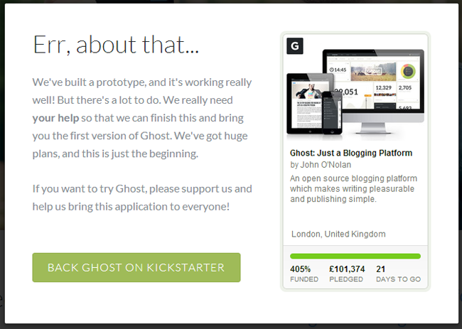
The official website of Ghost showcases what it can do, however the link to try the software out currently brings up a message advertising their Kickstarter funding project.
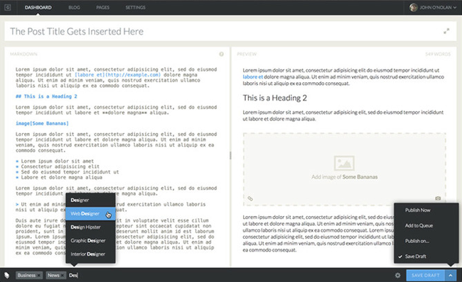
Though I have not been able to try the blogging platform out, the images which are available currently do seem promising. The post editor has a minimal styling. Content is spread out over two pages like a book.
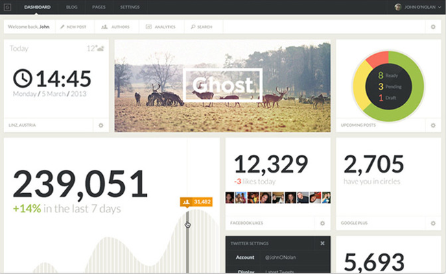
The dashboard displays gives you updates on the status of your blog such as the number of subscribers, traffic level and the number of people who have you in their Google+ circles.
The post management area looks very similar to the way the WordPress app handles posts on iOS (which is no bad thing). Posts are listed on the left-hand side with a preview of the post on the right.
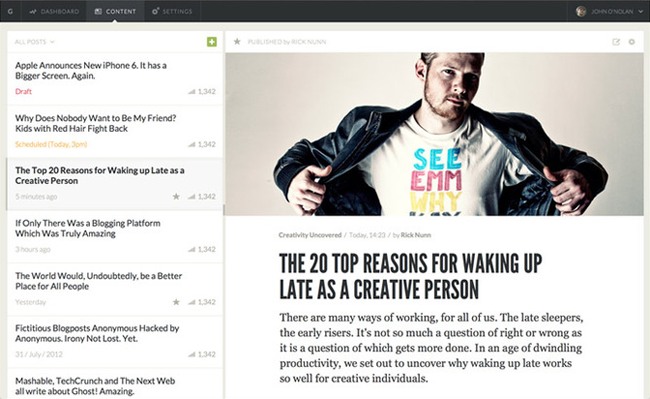
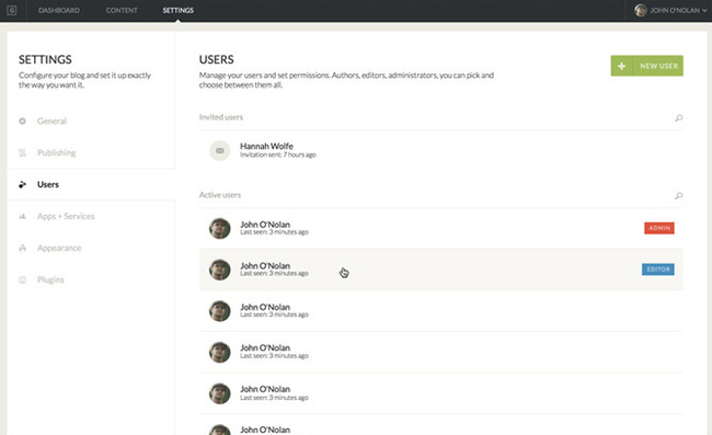
The layout of the admin area looks like a stripped down version of WordPress with navigation links at the top left, a profile link at the top right, and the sub-navigation links on the left-hand side of the page. It seems much easier to use with less options getting in the way of configuring your blog.
Ghost is mobile-friendly so looks great on desktops, tablets and smartphones.

There is still 19 days to go until the Kickstarter listing closes. There are a number of different options available for those of you who want to contribute; the cheapest being £10 to get a copy of Ghost before everyone else. When it is finally released, Ghost will be free.
It will be interesting to see how the platform is received when it is released. The look and feel of it reminds me of SquareSpace, but with one big difference: SquareSpace requires a monthly payment, Ghost will not cost you a penny.
I currently use WordPress to build all of my content websites though it is encouraging to see competition in this area. It will help all blogging platforms improve.
More information on Ghost can be found at the links below.
Thanks,
Kevin

