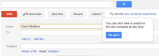
I was sending an email the other day when I noticed a message next to the email buttons that asked me to “Try out the new compose experience”. Being the happy link clicker I am I decided to try it out.
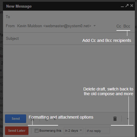
In the new setup Gmail has moved the email from the central area to a box at the bottom right hand side of the page. All options are still there however everything is more compact with icons replacing the usual text links.

Thankfully, Google shows you where everything is in the new setup so you aren’t too confused after switching to it.

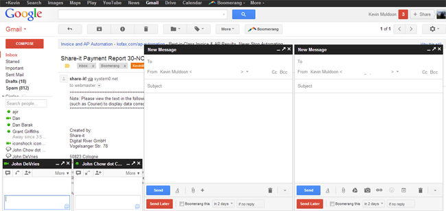
After a few minutes, it soon became clear what Google were trying to achieve with this. In the new setup you can write multiple emails simultaneously. I’ve found this to be useful as I sometimes jump between writing different draft emails.

In a resolution of 1366×768 pixels I was able to compose two emails and display two Google chat windows too. How many emails you can compose at the one time depends on the real estate on your screen (when I zoomed out I was able to fit several windows onto the page). Once all your page has been filled with windows, any additional emails you try to compose will appear as a pop up.
The way replies are displayed has been changed slightly too.

Whilst the new set up makes composing multiple emails better, sending just one is a poorer experience. By default the window loads up to the bottom right hand side of the page. I found this frustrating as your eyes naturally gravitate towards the left and centre of the page. By clicking on the upward arrow at the top of the compose email window you can open up the compose window in a separate pop up window; but writing the email in a pop up isn’t ideal and doing this kind of negates the whole point of using the new compose experience.
The only way to resolve the issue of writing the email at the bottom right hand side is to open up another email window so that two email windows are open. You can then compose an email using the centre email window. Clearly, they need to introduce an option where the location of the window can be moved, particularly for people like myself who are using a laptop (I suspect this is less of an issue for people with big screens).
Should you wish to change back, there’s an option at the bottom right hand corner that lets you switch back to the old way of sending emails. I’m unsure which method I prefer. I like the option of composing multiple emails and chatting on Google Talk at the same time. However, I need to be honest with myself about the fact that on most occasions I’ll just be writing one email and in that regard, the user experience isn’t as good because you need to write the email at the right hand side of the page. Plus I’ve found it frustrating not having the full editor when replying as I can’t add bullet points etc.
If you’re a Gmail user, I recommend trying it out for a few days. Let me know what you think about it as I’m still playing with it myself and trying to figure out which is better for me :)
Thanks,
Kevin

