I was browsing CodeCanyon recently when I came across a cool comparison plugin entitled Go. As fortune favours the brave, I contacted the developer and asked him for a test copy and he was happy to accommodate me (thanks Denes!!).
The full official name of the plugin is “Go – Responsive Pricing & Compare Tables for WP”. As the name suggests, it is ideal for pricing tables that list features and buy now buttons. It can also be used for comparison tables – a common feature on small affiliate websites.
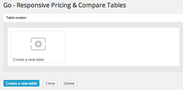
The main page shows all of your previously designed tables. In addition to cloning tables, you can also export and import tables to and from other websites.
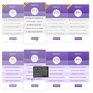
Global settings can be defined for each table such as table name and table id (the id is used for inserting your tables into your content area using shortcodes). One of the plugin’s distinguishable features is its ability to enlarge the current column that is being viewed. You can also change its colours. Its a cool way of making your content stand out.
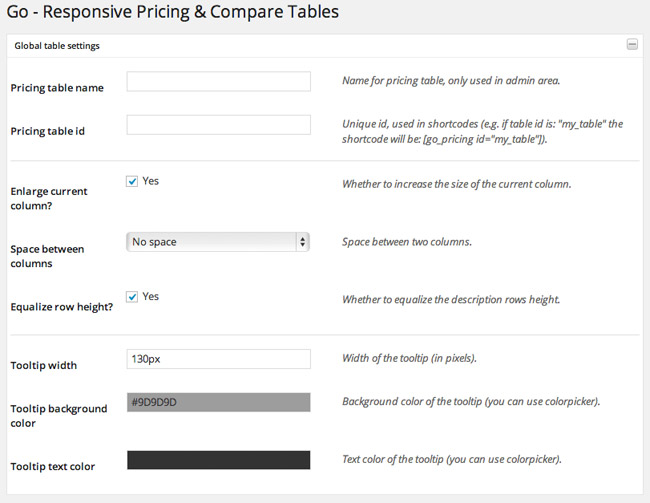
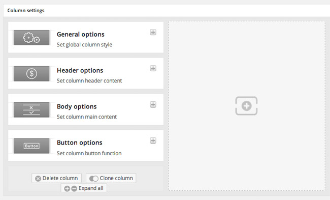
To create your table, you first add a column. You will then be presented with four setting options: General, Header, Body and Button. The body section is where you add additional rows.
There are fifteen styles of column design available and six different colour schemes. This makes a total of ninety styles to choose from when you configure your column. There are also five different styles of shadow and dozens of ribbon options.
In the header area, you can add a title, price and image. The default header can also be replaced by HTML. This allows you to use things such as images and sliders in your column headers. There is even support for adding Google Maps and YouTube and Vimeo videos in this area.
Adding rows is a breeze. There are dozens of icons that can be used for rows and content can be aligned to the left, middle or right. The button displayed at the bottom of each table row can be changed too. You can either use a regular button, a form button for PayPal, or a custom button.
At first glance, it may seem that there is a lot to set up; however the whole process of creating a new table should take you no longer than five minutes.
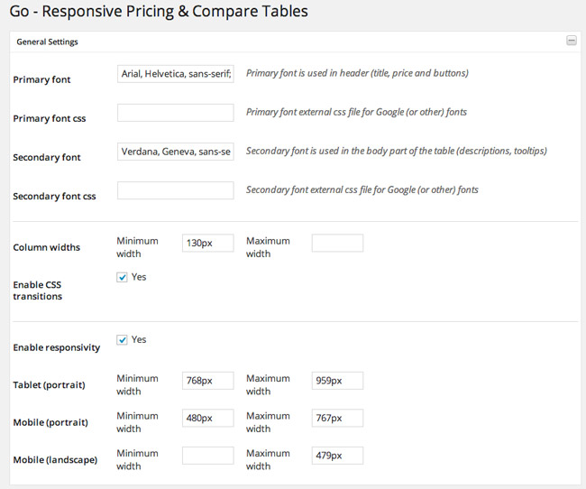
The general settings area allows you to change the primary and secondary font type and colours. You can also define the minimum and maximum table widths for desktops, tablets and mobile devices.
The final output looks amazing. Seriously, all you need to do is add a few images and some text and you will have a professional looking pricing or comparison table.
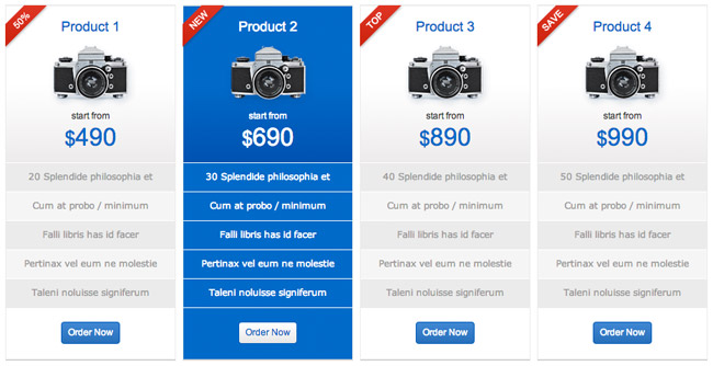
One of the reasons I was looking at Go as I was doing some preliminary research for doing a small affiliate website that compared products. I have not ironed out any details as yet, but my hope is that I will build a small review website when I can get free up one or two full days in my schedule.
It would not be difficult to develop. All I would have to do is write several small product reviews. I would then link to all reviews on the home page using the Go comparison table. The table would include important product information, a link to the review and a buy button that links directly to the product page (using an affiliate link). The reason affiliate marketers develop these types of websites is because they work.
If you are looking for a good table plugin for a comparison page or sales page, I encourage you to check out Go. It is available from CodeCanyon for only $17. It comes with great documentation and the developer supports customers every day through the comments area on CodeCanyon.
If you have any questions regarding the plugin, please let me know :)
Thanks,
Kevin

