According to a Pew internet survey, 92 percent of online adults use email, and 61 percent of them use it on an average day. That’s quite a large segment of people that you can send emails to everyday and not get the middle finger in return. Businesses, bloggers and entrepreneurs need a way to build email lists, create solid content and then send that content to the right people in a viable format.
This is where email marketing software like MailChimp comes into play. There are plenty of options to choose from in terms of these email sending systems, such as MailChimp, AWeber, Constant Contact and iContact, but none of them are turning more heads and breaking more rules than the MailChimp system, with their huge database of free eBooks, funny one-liners in the dashboard to make your day more bearable and click-and-drag design for iPads and just about any device you plan on using.
Let’s take an in-depth review of the MailChimp email list service and see if it’s right for your brand.
Pricing Is Perfect for Beginners (and Big Companies)
MailChimp offers three different payment plans that are actually quite easy to understand. It all starts with the Entrepreneur plan, which is one of the primary reasons I recommend MailChimp to so many people getting started with email marketing.
The plan doesn’t require a credit card and you don’t have to pay a dime until you pass 2,000 email subscribers. If you are just starting a blog or want to test this on a segment of your customer base, it comes out strong and works just as well as the higher paying plans.
Why not try something out for free before you know you plan on using it? For the Entrepreneur plan you can have up to 2,000 email addresses in your list, and send 12,000 emails per month.
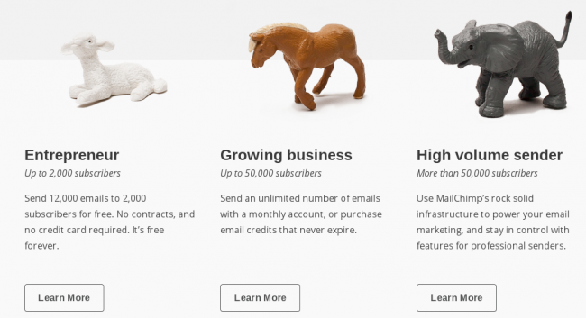
Once you pass the 2,000 subscriber mark it’s still quite affordable, but it’s all based on how many subscribers you have. This is called the Growing Business plan for businesses with up to 50,000 subscribers. Some companies would have to start paying from the start because they already send out more than 12,00 emails every month, but you can see below that the rates aren’t bad per month.
Keep in mind that emails per months are total emails that MailChimp sends out for you. So if you have 100 subscribers and you send out over 120 emails to all of these subscribers (maybe a little overkill?) you would pass the 12,000 email per month club and have to start forking over some cash.
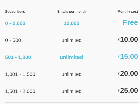
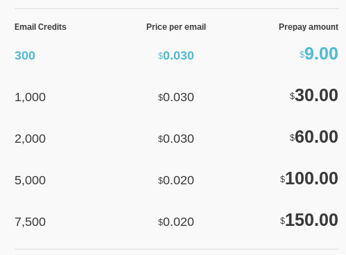
That’s a pretty good deal compared to some other competitors. There is also a Pay As You Go option for those who feel like they might end up pushing it with the subscription options.
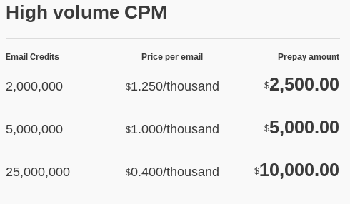
If you send frequently then this is probably best for you. Why? Because the price per email is cheaper since you just prepay a certain amount and get credits for each email.
The final payment plan in MailChimp is called the High Volume Sender plan, for customers with more than 50,000 email subscribers. Lots of big companies use this plan such as has Atlantic and Sierra Nevada.

I could only dream of having this type of email list for my blog, but for giant corporations it’s actually not that uncommon, so MailChimp has the power and capabilities to support even the biggest of lists.
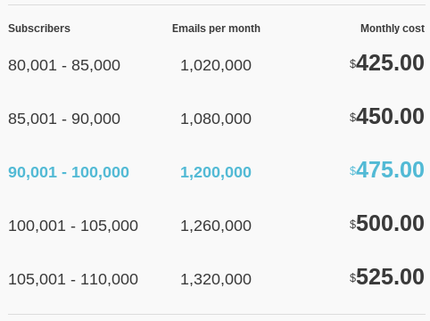
With this plan you can either pay a monthly fee or simply setup a prepaid plan which is typically used by those who don’t need to send out as many emails, but they have large lists.
The Email System from Heaven
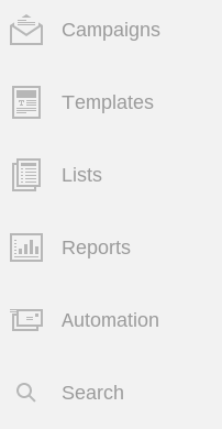
Once you decide on your plan and create a login for MailChimp you are navigated to the dashboard where you can manage your lists, create campaigns, develop templates and look at reports. Everything is easily accessible from the left-hand side.
Lists – Imports, Segmentation and Nice Forms
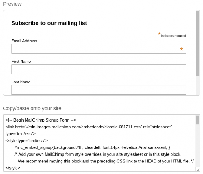
The Lists tab is where you start building forms to collect email addresses on your website. It’s also an area to manage the emails you collect and even segment the lists so that you can only send to a particular portion of the list. If you look at the shot below you’ll notice that you can go into the MailChimp platform and create a simple sign up form to put on your site.
They let you design the form and then give you all the code needed to copy into your site.
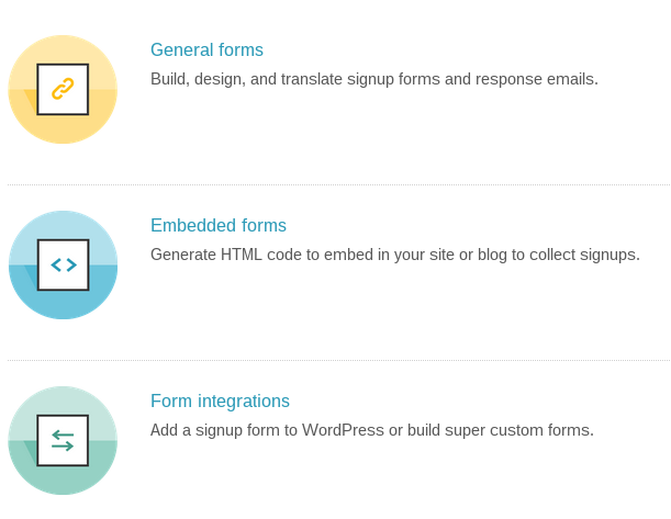
They offer three form options: General forms, Embedded forms and Form integrations. Embedded forms are what we talked about above and the General forms are simply for creating forms that you might not put on your website. Form integrations are nice if you know the type of system you use. For example, if you use WordPress, there is a way to quickly put an email sign-up form on your site.
Quickly manage all subscribers and add people from an Excel list if you are starting off with something like that. The manage subscribers area is perfect for specifying different segments in your list. So if you run a shoe store this might be helpful. Send emails targeted for women’s shoes separate from the men’s emails.

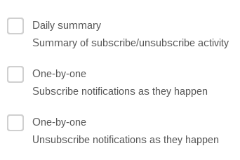
Another of my favorite features is the notification options, where they send you summaries or immediate emails when you get or lose subscribers.
Templates
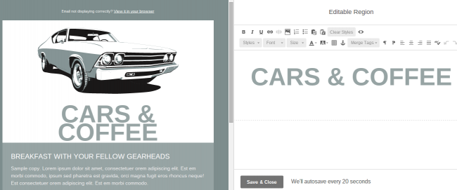
This is the fun part of email marketing–the area where you get creative and design something to send out. MailChimp has a clickable and drag-and-drop editor so you can see what is being edited on the right, along with the rendered changes on the left.
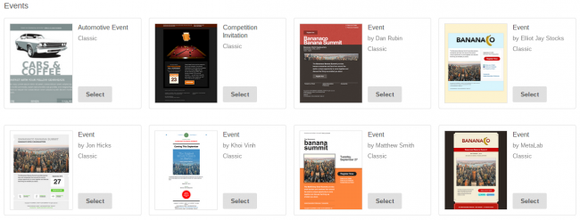
In order to choose a brand new template you can go to the library and select from a wide range of premade templates. I will say that I’ve used about four other email marketing software and MailChimp has the sleekest designs out of all of them.
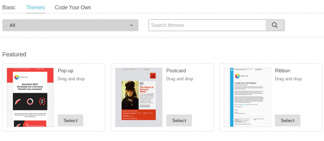
MailChimp also lets you choose your industry or category to find exactly what you need to contact your customers.
Campaigns – Managing Your Email Sending
It’s a tad confusing, but Campaigns vary from Templates in that they are the plans you put together to actually designate who you want to send to and what you want to send to them. As seen below, you choose the name of your campaign, what you want your email subject to be, and you can even personalize the “To:” field.
The thing I like most about this area is that you can run A/B Split tests where you choose two different Subject lines, MailChimp sends both to a small segment and then chooses the highest performing one to send to the rest of your customers. They also help suggest subject lines that run well.


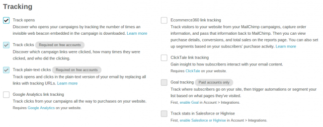
There are also plenty of other options when sending you campaigns such as social integration, tracking of your emails and Google Analytics integrations. A cool new feature is an area that tracks where your customers go on your website, then the system automatically segments them based on their movements. So if someone goes to your Sneakers section, send them a reminder to check out your new shoe line.
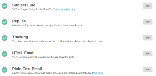
Once the campaign is finished, MailChimp double checks everything for you and you can schedule the email or send it out immediately.
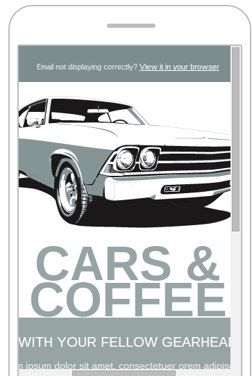
A nice touch is the preview and test areas, where it shows what the email looks like on different devices and where you can send a test email to yourself. I’ve noticed that most of the emails on MailChimp are responsive.
Automated Campaigns
Automation is where any email management and sender software really excels. MailChimp organizes its automated campaigns by workflows which you can edit and modify and even create yourself. Each workflow is a series of emails that go out automatically whenever a trigger is activated.
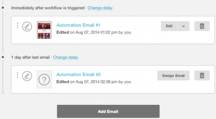
What else can you use the automated campaigns for? Send out birthday messages or feedback after an event or purchase. Some people even use the Goal integration to send a follow up email if a lead visits their website. This is perfect for B2B companies who really rely on the sales team and snatching up those people who come to a site.
Reports
The reports section works wonders for those people who love to crunch numbers. View an email’s 24-hour performance. This usually results in a steep downward slope, as you can see below.
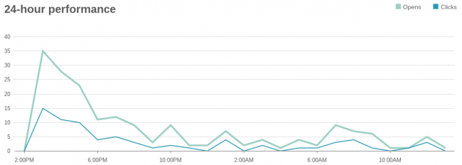
You can also check out my stats for a client I just started with a few months ago. View how many people open emails and click on links in each email, and even view how many abuse reports have popped up. Abuse reports are all about when people click on the Spam button.

Some other notable stats include top links clicked, locations of readers and social performance. There is also an area to track click-throughs and revenue reports if you run an eCommerce campaign for selling a particular item.
Additional Items That Make MailChimp Stand Out
The MailChimp blog is nice for learning about the company’s recent features and tips. They have various integrations to improve the effectiveness of your email lists, such as Chimpadeedoo for having a sign-up form on your iPad while at conferences and such.
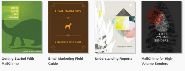
My favorite extra from MailChimp is their extensive free eBook library, where you can learn about MailChimp for Bloggers, How to Avoid Spam and more.
If you have any questions about the overall MailChimp system or its functionality, please let me know your questions in the comments section below. Making email lists with MailChimp is easy and actually quite fun, so share your thoughts on the brand and if you have any reserves in terms of choosing the service.

