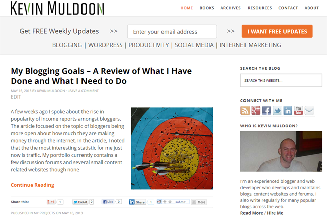
My love affair with StudioPress and all things Genesis continues. Over the last few weeks I had been looking at different blogging designs for KevinMuldoon.com as I had grown bored with the plain look of the last design. In the end, I went with another Genesis design.
Initially, I was not sure I would purchase another Genesis design. I love their framework however none of the designs I checked seemed to have the look I wanted. I looked at some designs on ThemeForest but there are few traditional blog style designs there. Therefore, I was leaning towards getting a custom design created.
Then I remembered about StudioPress’s Metro Theme, a beautiful design that they released a few months ago. I viewed the demo again and two minutes later clicked the buy button. It wasn’t a hard decision to make. As an existing customer of StudioPress, the theme only cost me $18.71.
The great thing about using Genesis is that I do not have to spend a lot of time configuring settings when I change the theme I am using. After activating the design, it took me around five to ten minutes to move all the widgets around to where I wanted.

One of the things I was looking for in a design was colour. In addition to five colour schemes, the theme was designed to be used with a background image. The theme also allows a second sidebar to be added though I am not a fan of that as it reduces the size of the main content area.
The sidebar of the Minimum design I used previously was 300 pixels wide but this design has a width of 336 pixels. I therefore increased the size of my picture and the banners. The theme has lots of widget areas too including one at the right hand side of the header and another underneath blog posts.

I quickly found some small flaws in the design. The featured posts widget that can be used on the home page uses a font that is super huge, making it impractical to use. Some of the styling has not been done correctly when hovering over links. For example, hovering over the comments meta link changes the box from green with white text to dark grey with black text, which makes it unreadable. This should be easy to fix,
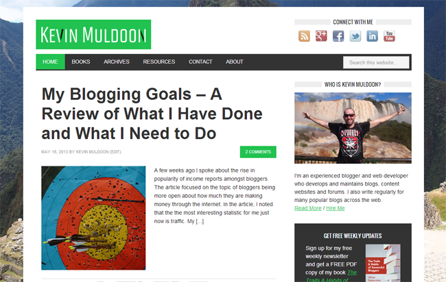
My biggest criticism with Genesis has always been how overcomplicated it is to add a custom logo. It always requires you to edit the functions.php template. This time was no different. Simply adding my logo using the WordPress feature function did not work. Doing so created a large green box in the header.
The best solution I found was from Black Hill Web Works. Unfortunately, this solution kept a green background for the logo image. Changing the background colour of the logo title also changes the colour of the navigation menu.
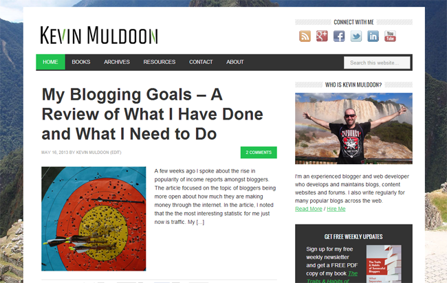
I have raised this issue with StudioPress. Once that is resolved, the design should look something like this:

I’m pretty happy with the design right out of the box. I may change some small things such as the dotted background for headers, but generally it is going to be left as it is. I’d love to hear your thoughts on the new design. Is it a marked improvement over the old one?
Kevin

