WordPress have just announced the release of WordPress 3.8. The release greatly improves the look and feel of WordPress.
Let’s take a look at what WordPress has improved upon in its latest release.
A Clean Modern Refresh of the Admin Area
In my preview of the Ghost blogging platform earlier this year, I noted that the WordPress admin area was looking a bit dated.
My hope was that platforms such as Ghost, which boast a modern, clean design, would encourage WordPress to improve their design. Thankfully, they have. Visually, WordPress now looks fantastic. The clean design has beautiful typography and looks very modern.
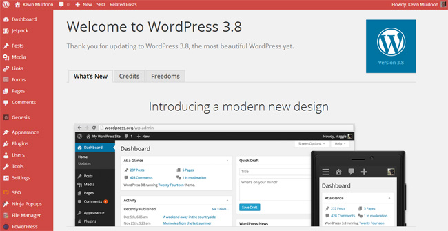
Previously, there were two admin colour schemes to choose from. Now we have eight. The blue and sunrise colour schemes, in particular, are bright and colourful.

Looking Great on Mobiles
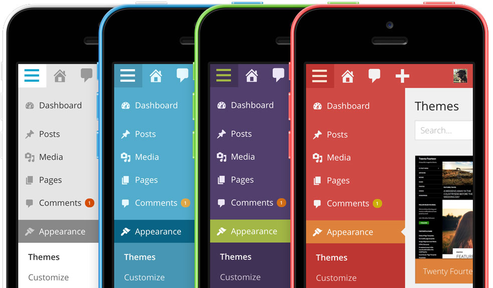
The WordPress mobile apps allow you to administrate your website directly from your smartphone or tablet. Mobile users can now administer their websites through their browser more easily. The admin area has been revamped so that it looks great on smartphones, tablets, laptops and desktops.
Improved Theme Management
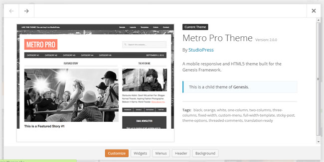
The theme management area has been improved too. It has a cleaner design and is easier to use.

Clicking on a theme will show you more information about the design.
Twenty Fourteen Theme
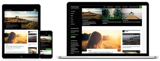
WordPress’s latest default theme is included with WordPress 3.8. Twenty Fourteen is marketed as a magazine design, though it is essentially a blog design with a featured post area at the top of the page. Featured content can be displayed as a grid or as a slider.
Summary
WordPress 3.8 can be summed up as a release in which the look of WordPress up to date. It will also be remembered for the inclusion of Twenty Fourteen; a design which I believe is going to prove very popular with bloggers. It will be interested to see how theme developers fork Twenty Fourteen and create unique designs from it.
For a full list of updates in WordPress 3.8, please check out this page in WordPress.
Time to get updating :)
Kevin

